OFSTED Heatmap - The Main Page
This is the third post (parts: one & two) in my series about how I tackled building a web application which graphically indicates when schools in my local borough of Bexley had last been visited by OFSTED.
A Wireframe to Rule Them All
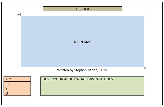
The first step was to create a wireframe for my page. I know from the limited functionality and requirements that it didn’t need to be too ambitious, but still, this was an important step in grasping how the main front-end elements would fit together.
So what exactly is a wireframe? In many respects, as Winnie explains, it is much like the blueprints for a house design. These too are a series of line drawings but they form a vital link between the ideas of the architect and the actual builder who will put them into bricks and mortar. In my case, that’s a link between my fuzzy brain and my final implementation! Given the above, this is how I envisaged it looking:

This was my initial idea but upon looking at it closer, I decided to centre the key and descriptive area and of course (is it of course?) not use those colours - they were just to indicate the various areas. I was also in two minds where to put the key and as you will see later when I style the page, I chose to swap where it went, too.
HTML Implementation
When I first learnt HTML (before HTML5), there were these incredible HTML tags for centring elements, changing fonts, making things flash etc. Did you know that? Ah, the good old days.
The main problem with this style of doing things was that the information and how it was presented was far too closely coupled (linked). Fortunately now, there is a clear separation between what the elements of your web page actually mean (the semantics or structure) and how they are presented, usually using something like Cascading Style Sheets (CSS). This style of doing things brings a host of advantages such as:
- Making it easy to change the look of the page/site,
- Allowing pages to be more responsive - altering their presentation to fit better with the device viewing them,
- Making it easier to extract meaningful information from the HTML and
- Improved search engine readability meaning search engines better understand what your site/page is about, amongst other things.
To that end, let’s take a look at what I did to do to prepare the semantic (or structural) side of things - the HTML.
1 | <header> |
Here you can see the main heading for the page which is quite straight-forward, followed by a DIV tag. DIVs are elements that will allow you to create areas and name them within your page. Keep this in mind because I will return to it for the map, later.
1 | <section id="key"> |
This is the first of the wireframe elements that is worth talking about - the key which describes what all the icons on the screen represented. I chose to make this into a table but my first attempt was to use a definition list (DL element). I think in this case either were fine but I found it easier to organise it in a columnar fashion this way.
You can also see that I am borrowing some Google icons (

 ). I liked these because they fit in nicely with my aim of giving a traffic-light impression for it all.
One last thing of note is that I have used sections which are thematic groupings of content. In this case, the grouping is the fact that it all represents the key. There is also an id attribute used which I will refer to later when it comes to explaining how the styling of this page will look.
You might also have noticed another id attribute used - remember the DIV right at the top?
1 | <section id="about"> |
This section is the About one which is in green in the wireframe. Here, I used an unordered list because a) it is a list (of the icons) and b) the order, whilst there, wasn’t too important. If I had chosen an ordered list (OL element) I would have only turned off the numbering, anyway. Again, I label this section with an id of “about“. I will definitely need that later.
1 | <hr> |
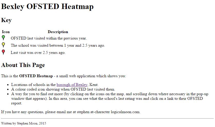
Almost done now. Here is the footer for the page underneath a thematic break (visually represented by a line on most browsers). OK, so there were a couple of parts missing (such as the outer HTML tags and header element) but this is the gist of it. Get ready for the scary part because this is what that looks like in the browser:

Eek! No sign of a space for a map and it looks pretty terrible. In the next post, I will discuss how this gets prettified using style sheets.
Hi! Did you find this useful or interesting? I have an email list coming soon, but in the meantime, if you ready anything you fancy chatting about, I would love to hear from you. You can contact me here or at stephen ‘at’ logicalmoon.com