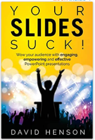
Book Review: Your Slides Suck!

I mentioned in my year end review that I had given a talk at the NCA and as you might expect, I used presentation software to produce some slides. How I wish I had read this book by David Henson first!
I grabbed my copy of Your Sides Suck! from the local library as an after-thought and almost didn’t because of the click-baity name, but I am glad I did.
Your first thoughts on skim reading it would be that there wouldn’t be much information. Lots of images, gaps in text and half-filled pages, but I now think that is what makes it so digestible. I was easily able to pick this up, read a chapter, and come back to it another day.
The book begins by introducing an acronym: A SAMPLE OF RICE which stands for the following -
- S SUBJECT
- A AUDIENCE
- M MESSAGE
- P PLACE
- L LENGTH
- E EXECUTION
This makes you think about what you will be talking about, to whom, what their takeaway from it will be and where the presentation will happen. Lastly, it reflects on how long the talk will be and how you will go about it, but what I think was a little more useful is RICE.
- R REINFORCE
- I ILLUSTRATE
- C CLARIFY
- E EXPLAIN
He uses this one to guide you into thinking how imagery (diagrams, photos, charts etc.) can actually enhance the slides. The idea is that you really consider whether what you are adding, “adds” to the presentation and in which way.
What I especially loved were the examples where he showed a boring, verbious slide (just like I had produced!!) and replace them with beautiful, impactful slides, that enhanced the information you are trying to give. It made me think of all the supplier presentations I had sat through and how nice (aka professional) they look - that’s exactly what he is trying to help you achieve with this guide.
One other big aspect I will take from this is the idea that you may be better off not using the standard templates that things like Powerpoint direct you towards. I’m talking about those standard slides with a heading at a top, graphics round the side, a fixed area in the middle and so on. Instead, he suggests deleting all of that and creating your own, custom masters. Sounds painful but he shows you exactly how.
Another nice touch is that if you sign up to the author’s website, you can access videos which complement the sections in the book. That’s especially helpful when otherwise he would have to fill pages with instructions which could become boring or try to write about the animations, rather than be able to show you.
All in all, I would buy this if you think there is a chance you might produce any presentations. It will be well worth it and sorely tempts me to re-do my presentation slides!
Hi! Did you find this useful or interesting? I have an email list coming soon, but in the meantime, if you ready anything you fancy chatting about, I would love to hear from you. You can contact me here or at stephen ‘at’ logicalmoon.com